Breath of the Wild loading screen - but on the web
A result of too much time on my hands and too many hours into Breath of the Wild.
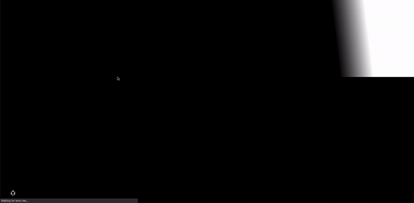
The final loading animation
View the code on GitHub and check out a live demo of the project here!
Background
During spring break 2018, I planned on going on my first ever ski trip with my friend (and current roommate). I had gotten everything packed to hit the road, but the day before the trip I became so sick that I could not in good conscience go with his family to Colorado. Instead, I spent the entire week bedridden on the couch, playing the new Legend of Zelda game that my brother had recently gotten for his Switch. This video game brought me sheer wonder and joy as I explored the amazing open world, and completed just a fraction of all the adventures that the game had to offer. I tore through the game over the next 8 days and eventually was able to defeat the final boss before my semester resumed on Monday.
Fast forward a year and a half, and I was again on break from college (this time in the winter), without much to do. Again, I was playing copious amounts of Zelda, and pointedly ignoring the goal that I had set for myself of updating my personal website. With these two topics in my mind, I thought about how nice the game loading screen would look on a website, and thus this project was born.
The web part
Because this was just a simple, meaningless project that I was trying to finish ASAP, the tech involved is not anything to write home about. I have an index.html file with a bunch of divs (maybe not the most semantic of HTML), a styles.sass for the styles and looping animations, and main.js that handles all of the timed animations, as well as the code to display the game tips. SASS and Jquery were used for no other reason than to allow me to write code faster, even with the extra overhead.
Getting started
What seemed like a relatively straightforward animation actually had a lot of moving parts once I broke it down. There were so many subtle transitions, interactions, and details that I only noticed once I started playing the loading screen frame by frame. Some of the most interesting to me were:
- The subtle glow of the triforce logo in the bottom left once the animation is complete.
- The bounce of the Vah Naboris icon (the camel-shaped one, second from the left).
- The wipe-in/out animation of the top part of the screen.
I spent a large amount of time taking screenshots, timing animations on my phone and ensuring everything was as close to the original as possible. This include matching colors, sizing, and icons seen in the original game. Because many of the icons here are exclusively shown in the loading screen, it was hard to find an existing repository of assets that included the icons I needed, but I eventually found a zip dump of the game files that included the original images (and even found a similar typeface!!).
So many animations
The divine beast animations in particular were very time-consuming to create. There are 4 of them, each with different animations running on different timers, conveying different emotions. However, the process of creatin and slowly tweaking them to match the game was actually very fun, and I think well worth the effort. For example, here is the code for one of the divine beasts (compiled from SASS -> CSS)
@keyframes vah-naboris {
  0% {
    bottom: 0;
    right: 0;
  }

  15% {
    bottom: 4px;
    right: 3px;
  }

  30% {
    right: 6px;
    bottom: 0;
  }

  35% {
    right: 6px;
    bottom: 2px;
  }

  40% {
    right: 6px;
    bottom: 0;
  }

  43% {
    right: 6px;
    bottom: 1px;
  }

  46% {
    right: 6px;
    bottom: 0;
  }

  60% {
    right: 6px;
  }

  100% {
    bottom: 0;
    right: 0;
  }
}
As you can see, the animation has 9 steps, and each step of the animation usually only shifts the image by just a few pixels. But altogether, it leads to this smooth, continuous animation:

Animation of the divine beast Vah Naboris
Getting the details right
This project really was a labor of love, and I tried to ensure that I got every detail right to the best of my ability. This included setting unique game tips that could be swapped by the user (either by pressing ‘a’, ‘enter’, or clicking on the screen), making sure the animations and styles still appeared natural on mobile devices, and even creating a master mode version to mirror the loading screen of DLC.

The final loading animation for Master Mode
These small details by far took the most time to find, create and implement. Although individually each detail will likely go unnoticed by 99% of people who visit the site, they add up to an experience that I hope is smooth and more immersive for the user.
Feedback
I have ended up talking about this project in a surprising amount of interviews, mainly because it was a ton of fun to create and I really enjoy any opportunity that I get to talk about my love for Breath of the Wild. Usually, I get an ‘oh that’s neat’ when showing it to friends or family, but every once and a while I will show this project to someone who is as crazy about the game as I am, and they’ll sit there and geek out with me about it.
Once I was satisfied with the project, I posted it on the r/web_design Reddit community and got a ton of positive feedback, which definitely gave me the validation I needed to continue making even dumber web projects in the future.
Conclusion
To wrap up: please play Breath of the Wild, it is an amazing game and I cannot rave enough about it.